Daymart
A little of everything, for everyday life. A case study exploring a welcoming retail identity across packaging, store signage, social content and a digital shopping concept.
Everyday life. All under one roof.
Daymart is a fictional retail brand concept by Islah, exploring how groceries, fresh food and home essentials could share one welcoming identity. A bold lowercase wordmark pairs with a simple sun-like symbol. Deep green anchors the system, while coral, yellow and cream bring warmth and energy.
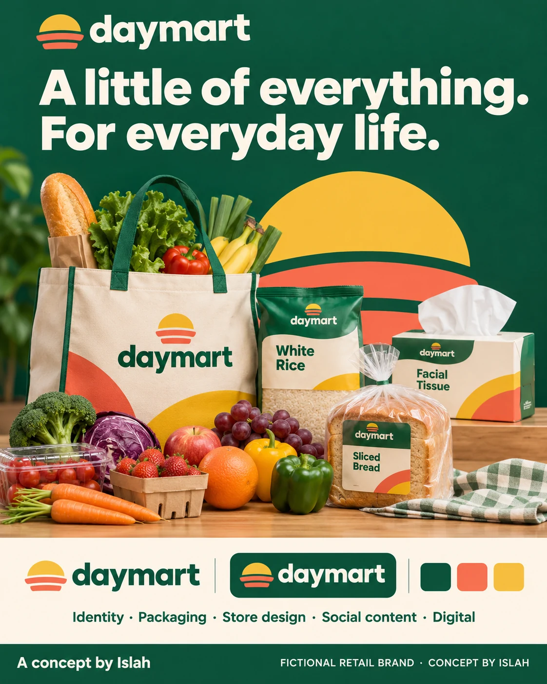
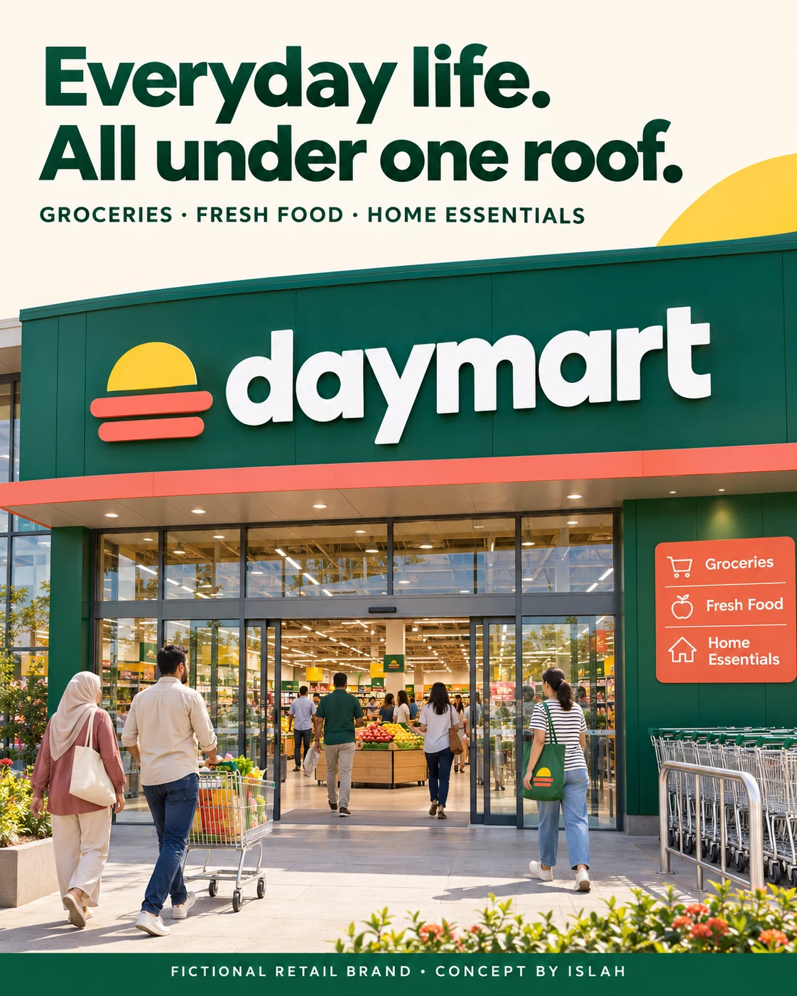
The identity board brings the range together. The entrance mockup shows how the same wordmark, symbol and colour relationships can work at architectural scale.
A familiar face across the basket.
The produce and pantry concepts use the same visual cues in different ways. Fresh ingredients lead the produce scene, with a branded paper bag at its centre. Pantry packaging repeats broad curves, clear product names and colour blocks across rice, pasta, oats and lentils.
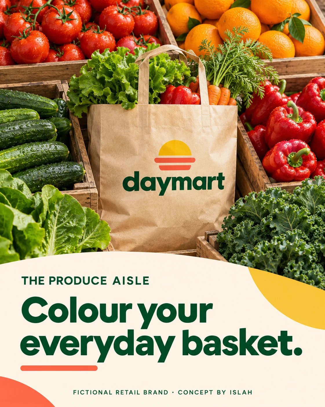

A recognisable bag connects the fresh-food story to the wider brand. The pantry range demonstrates a flexible packaging system across several formats.
From the breakfast table to the bakery.
The dairy and bakery presentations connect category-specific messages with a consistent retail voice. Bold headlines give each piece a clear point, while cream surfaces and green typography tie the layouts together. Packaging, bread sleeves and patterned wrapping extend the identity into everyday use.
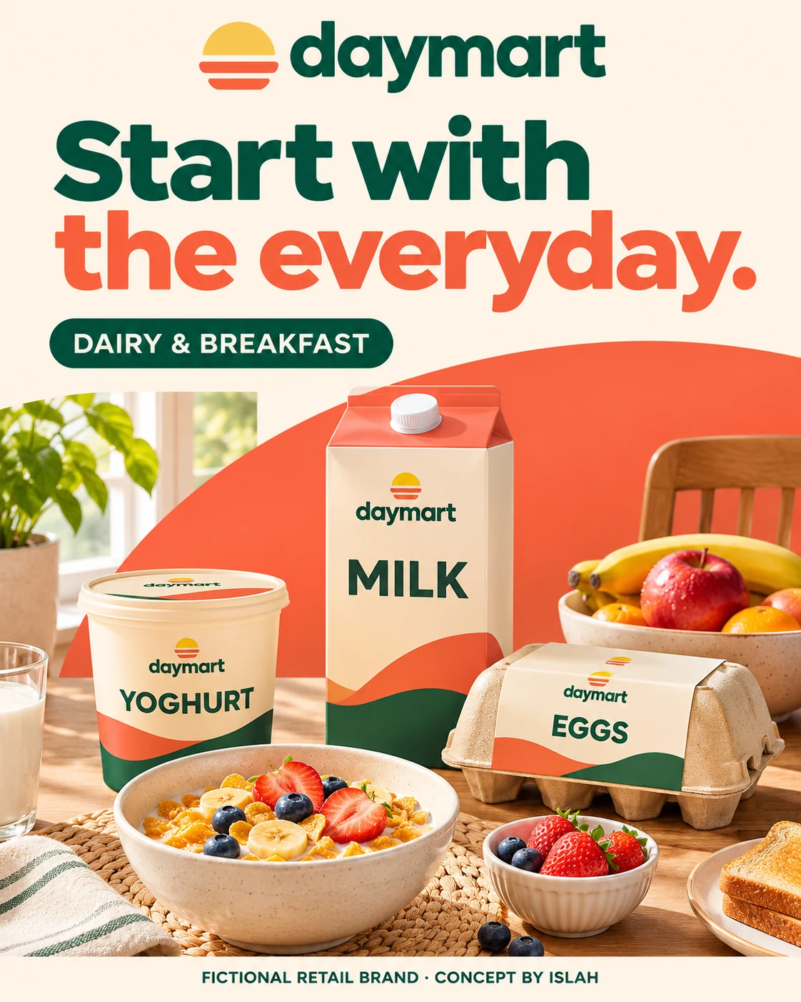
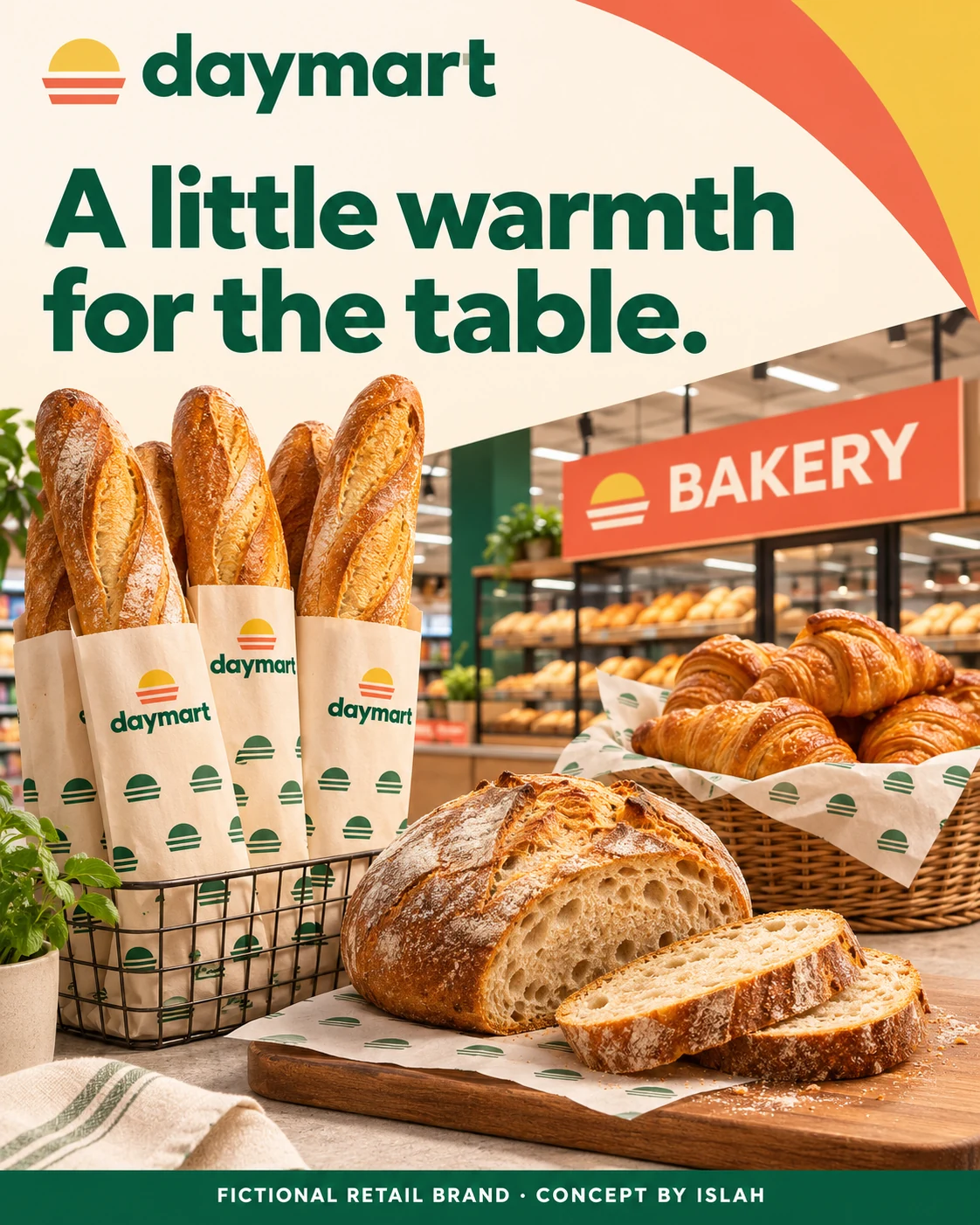
“Start with the everyday” and “A little warmth for the table” express different shopping moments through the same approachable design language.
A brand that goes home with you.
The home-essentials concept adapts the curved colour system to cleaning and household packaging. Tote bags, paper carriers and a loyalty-card mockup then carry the identity beyond the shelf. Repeated shapes and a clear wordmark connect these varied applications without making every layout identical.
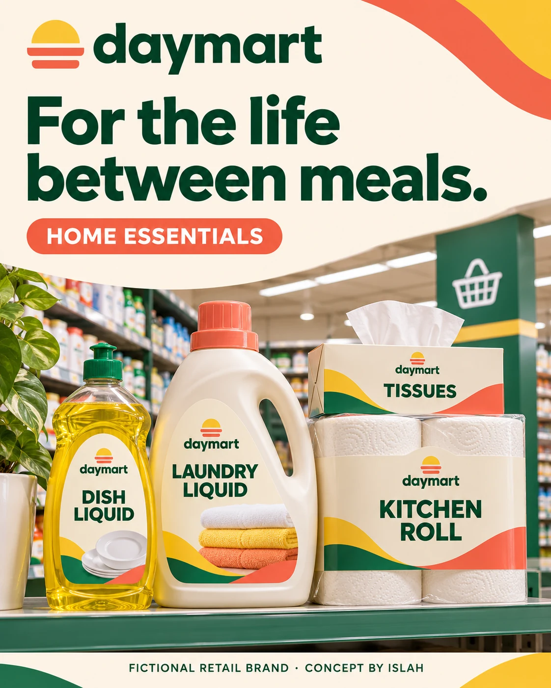
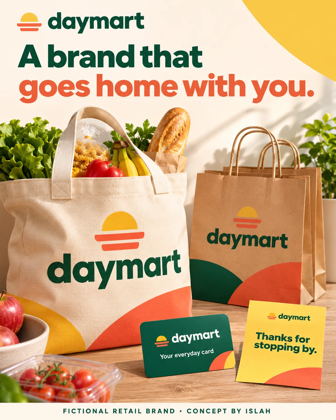
Household packaging and take-home touchpoints show how the retail concept could stay recognisable across the wider shopping experience.
Find your way to the everyday.
The online-store concept organises groceries into Fresh, Pantry and Home, carrying the same category language into desktop and mobile mockups. Interior signage explores that structure in a physical shop, using large labels and strong contrast to distinguish departments and checkout.
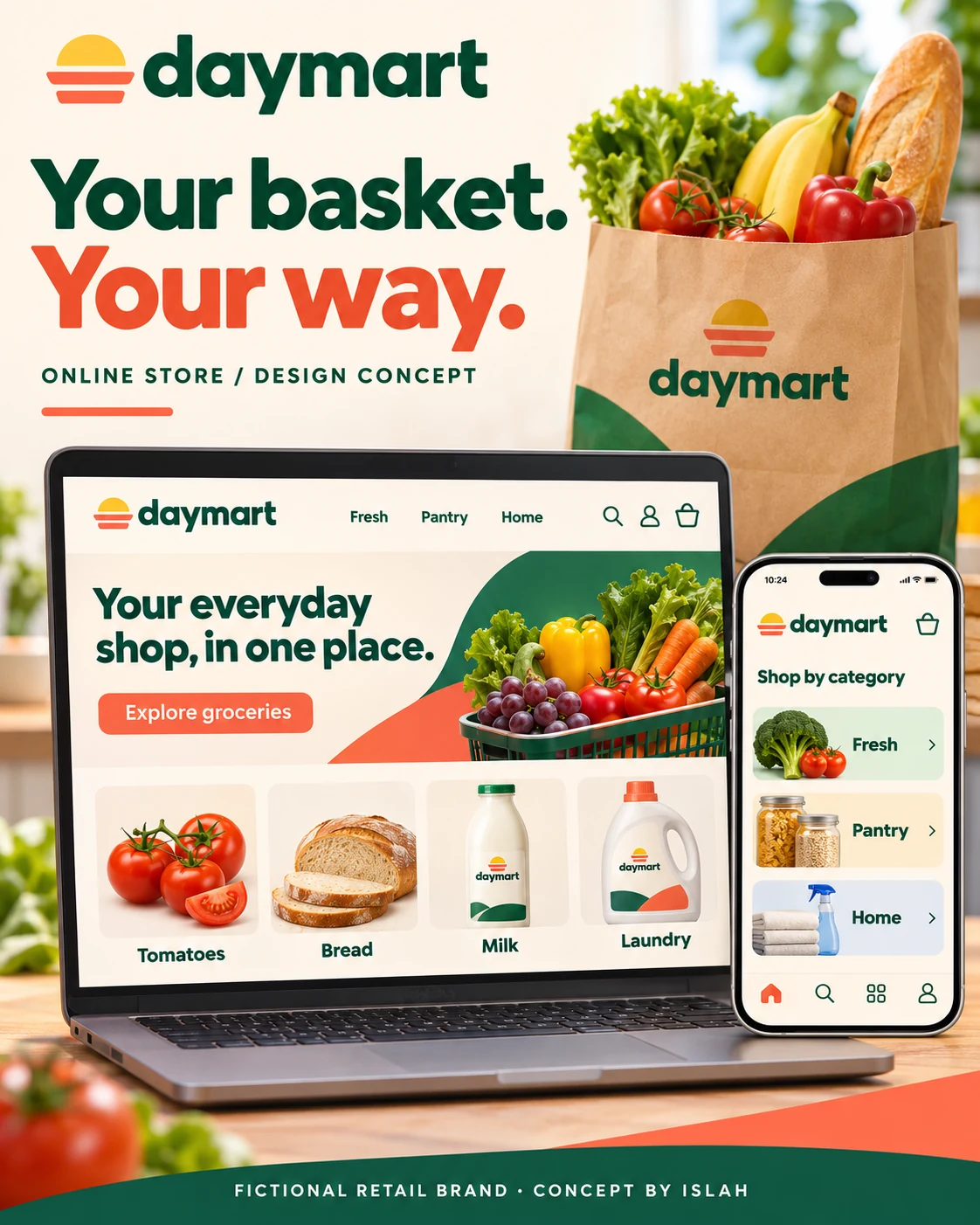
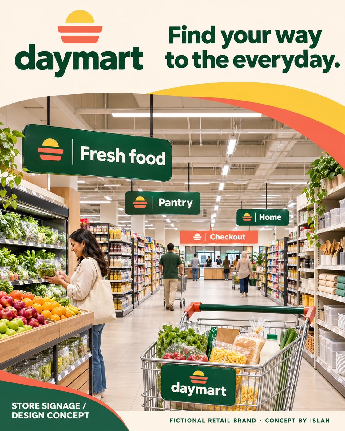
The website and store-signage visuals are design concepts. Together they explore a connected experience across a proposed physical store and digital shop.