Foldo
A fictional project workspace brand exploring a calmer way to bring projects, people and progress together. A coordinated visual campaign using folded shapes, mint, lavender and navy across ten creative applications. Concept by Islah; not a live product or commissioned client project.
A calmer place for busy work.
Foldo is an independent concept for a project workspace brand. Its central idea brings projects, people and progress into one recognisable visual world. The opening designs connect that promise to a familiar frustration: files scattered across different places.
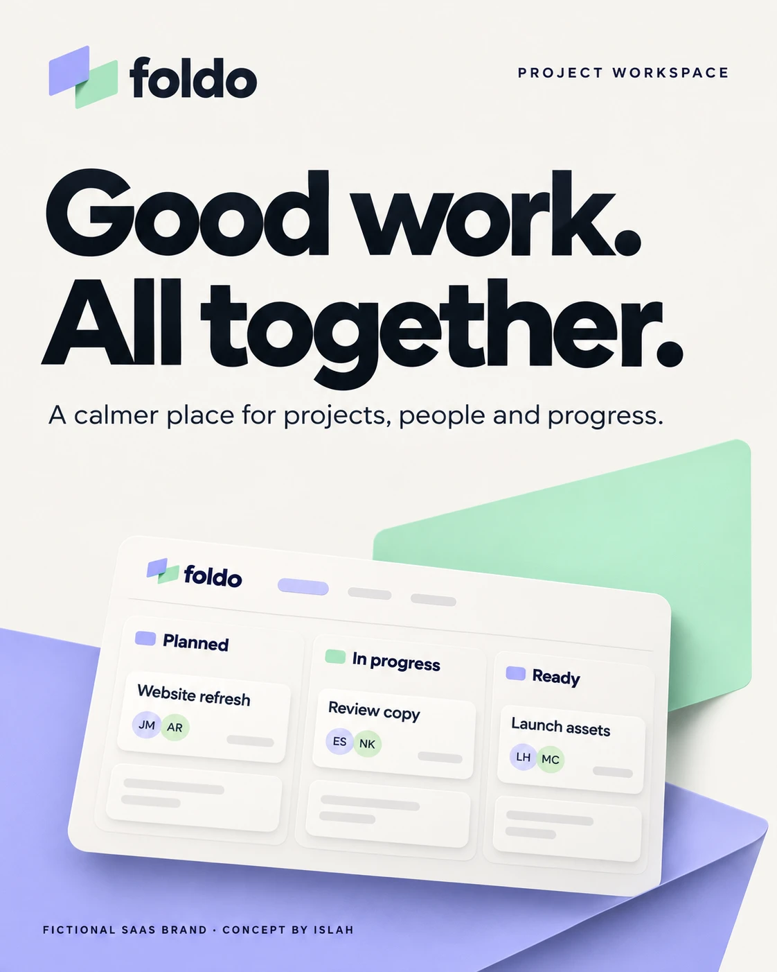
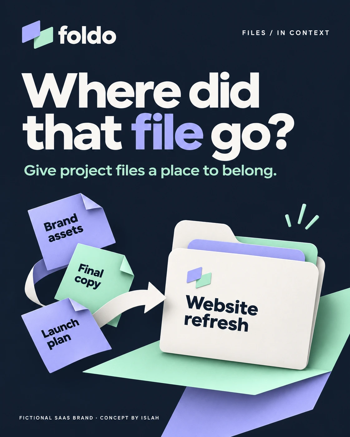
The introduction sets the tone; the file-organising illustration makes the idea concrete.
Folded shapes. Connected thinking.
The overlapping planes in the symbol become a repeatable design device. Mint and lavender shapes fold behind cards, connect interface elements and frame the work. Navy adds contrast, while light surfaces keep the layouts open and readable.
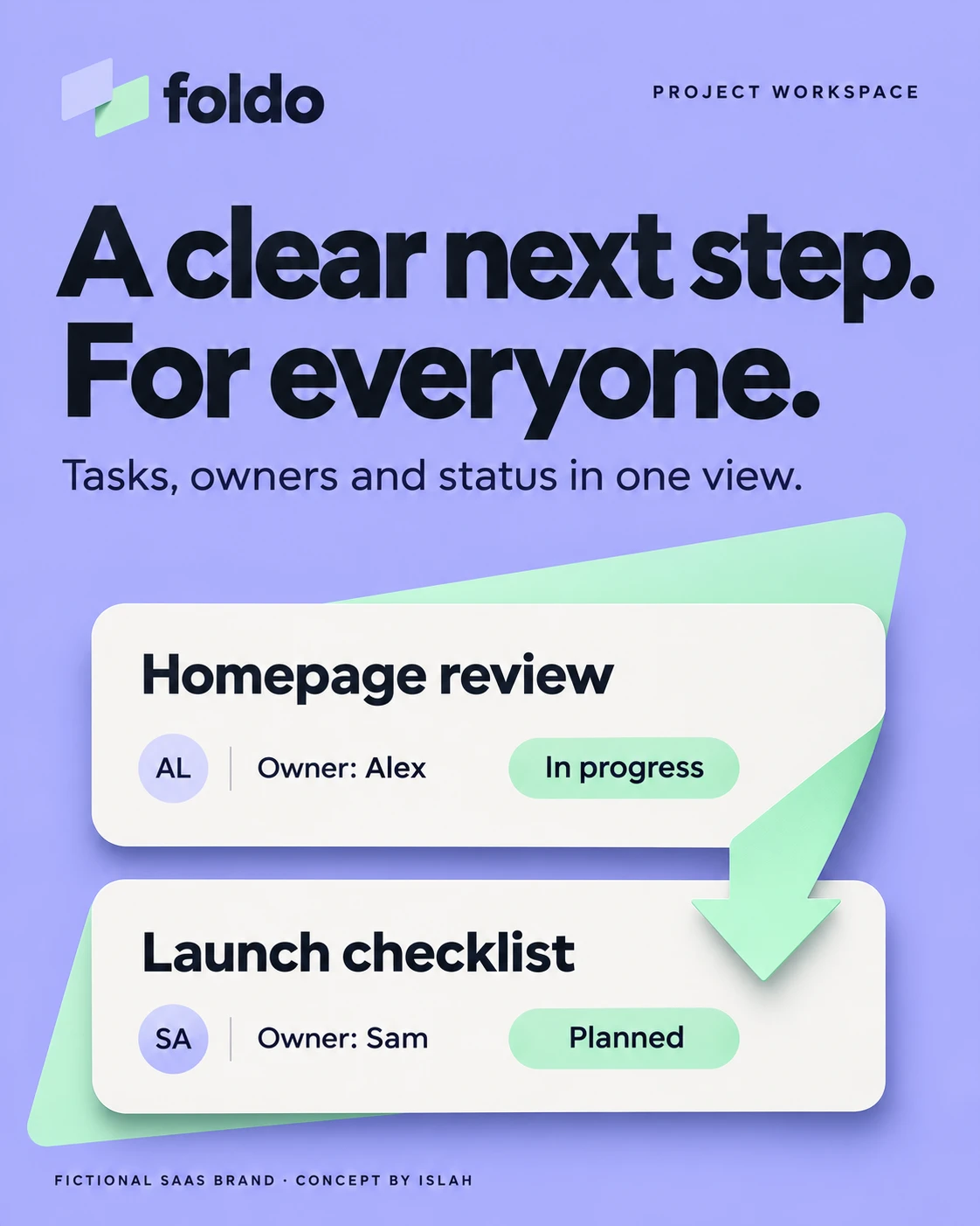
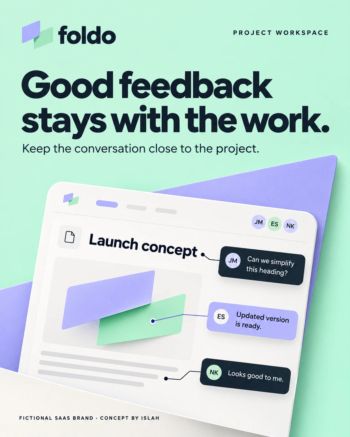
Task ownership and feedback are presented through the same shapes, colour relationships and rounded cards.
From features to everyday meaning.
The copy focuses on situations people recognise: different schedules, unclear updates and time spent chasing information. Short headlines translate those situations into a simple point of view, supported by interface-style illustrations.
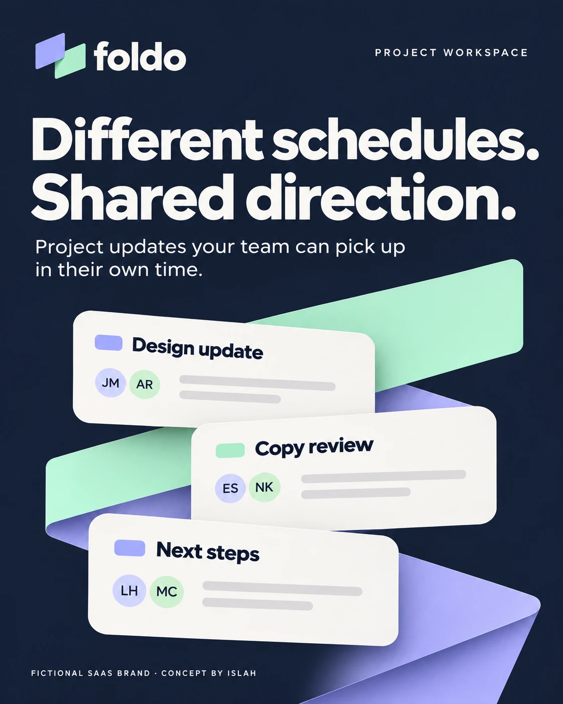
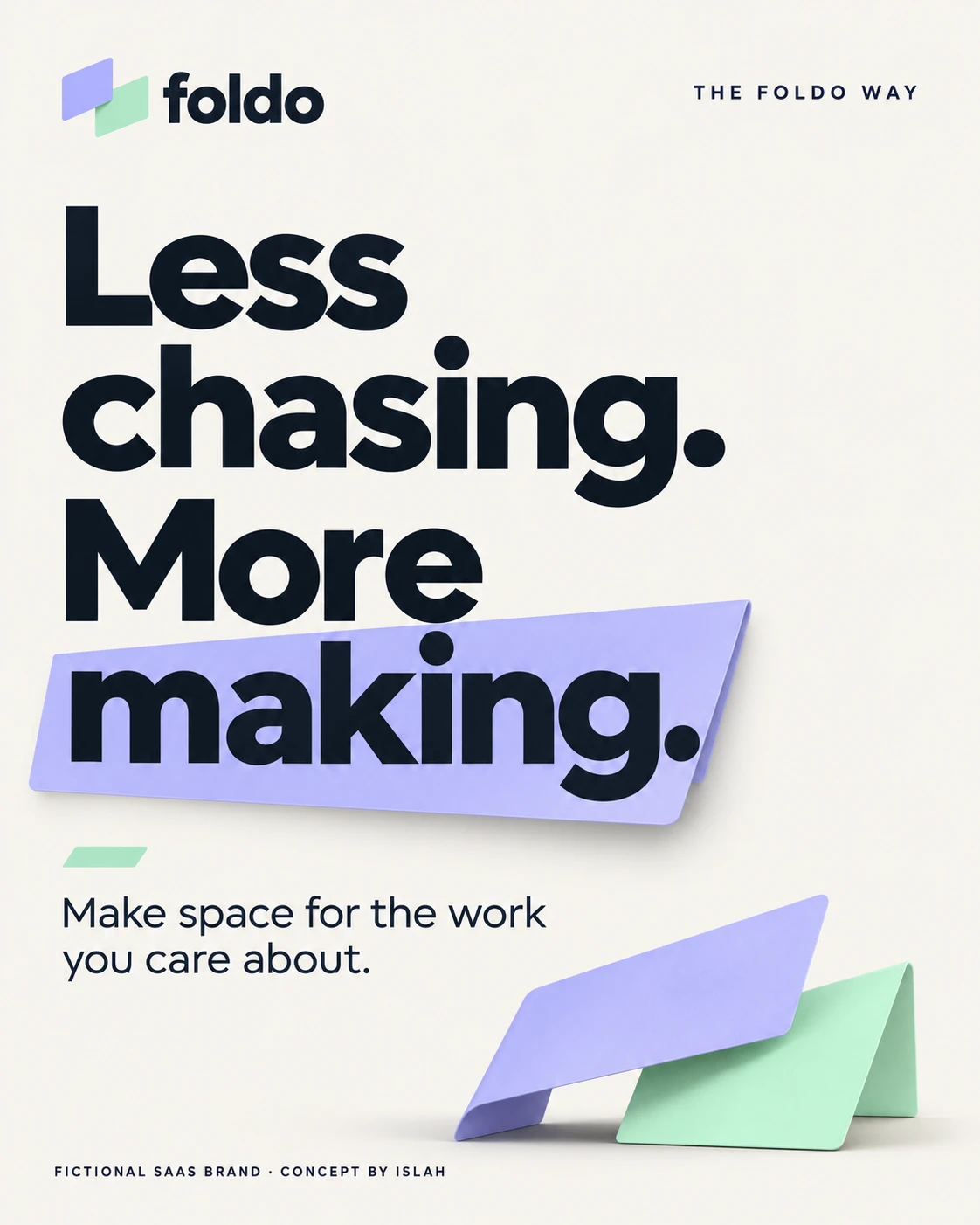
“Different schedules. Shared direction.” and “Less chasing. More making.” carry the same promise in different ways.
A consistent identity with room to vary.
The campaign alternates dark, light and lavender backgrounds without changing its core typography or folded forms. Some pieces lead with a statement; others use a short checklist. That variation gives each message its own space while keeping the collection connected.
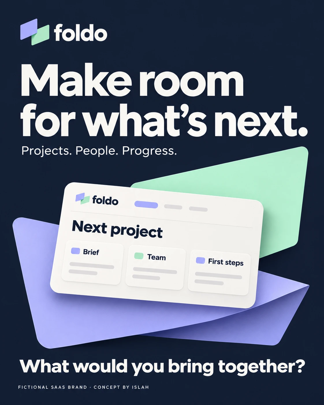
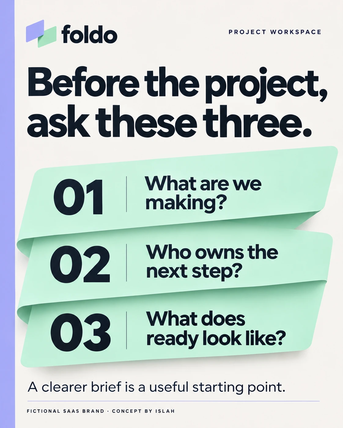
A forward-looking brand statement sits alongside three practical questions for starting a project.
The same story, from screen to team.
Board and list layouts explore how the identity could appear around a project interface. A team scene brings a human context to that visual world. These are concept illustrations of a fictional product, rather than evidence of a working application or customer use.
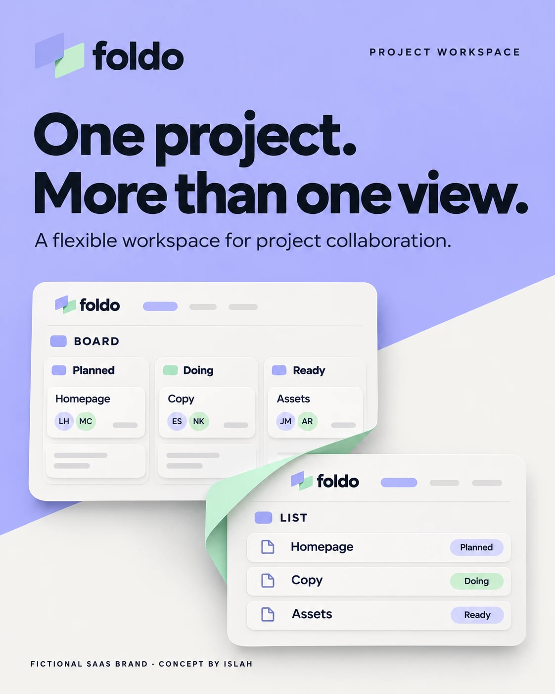
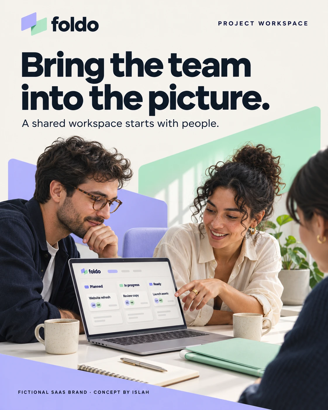
The final pair connects the interface language to the people the workspace concept is intended to serve.