Lumenna
Designed around how light feels. A case study exploring a coordinated identity, art direction, packaging, campaign content and digital presence for a fictional lighting brand.
One identity. Every atmosphere.
Lumenna is a fictional lighting brand concept by Islah, built around the relationship between light, materials and atmosphere. The widely spaced wordmark and fine halo symbol create a restrained signature. Midnight teal, warm ivory and copper give the collection a consistent visual foundation.
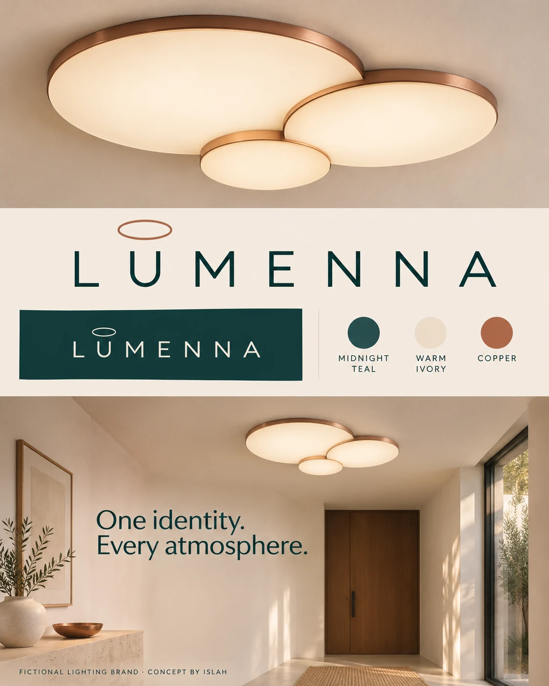
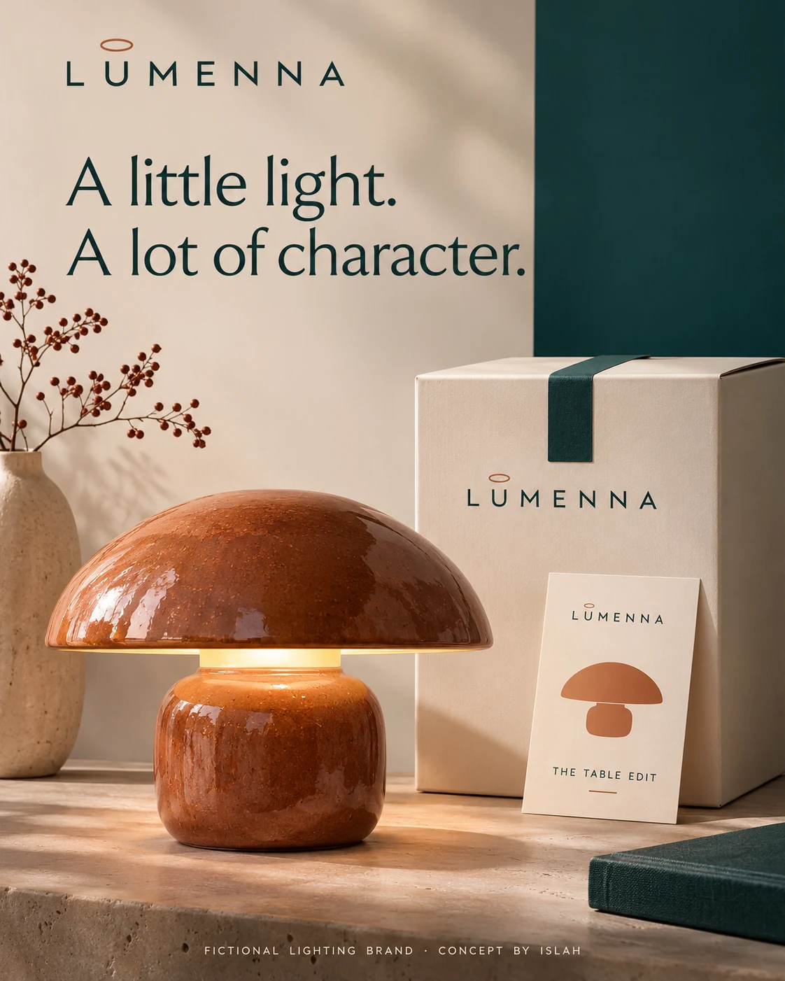
The identity board establishes the palette and halo detail. The table-lamp presentation carries those cues into packaging and a collection card.
A room begins with a feeling.
The imagery places each light within a considered interior, showing its relationship with surrounding surfaces and furniture. Warm illumination, stone textures and quiet compositions connect the chandelier and wall-light campaigns while allowing their different forms to lead.
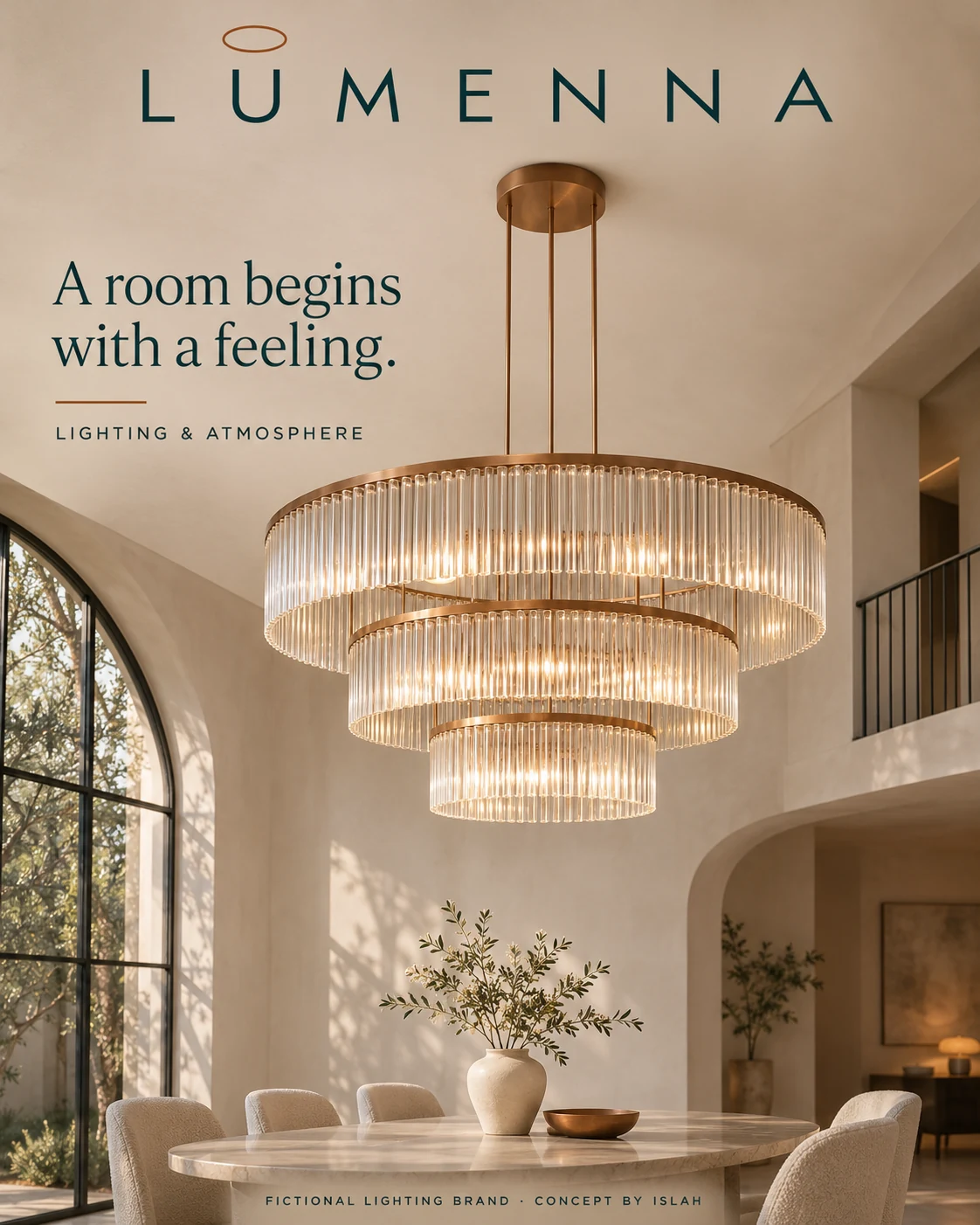
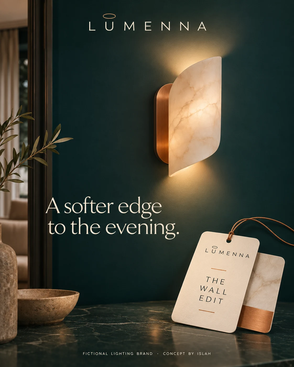
The chandelier creates a focal point above a dining space; the wall light brings the story closer to material, glow and a tactile product tag.
Different forms. A shared language.
The pendant and outdoor concepts use the same wordmark, copper accents and warm tonal direction across very different settings. A catalogue cover groups the pendant into a collection, while the outdoor layout combines an arrival scene with a close-up detail and supporting copy.
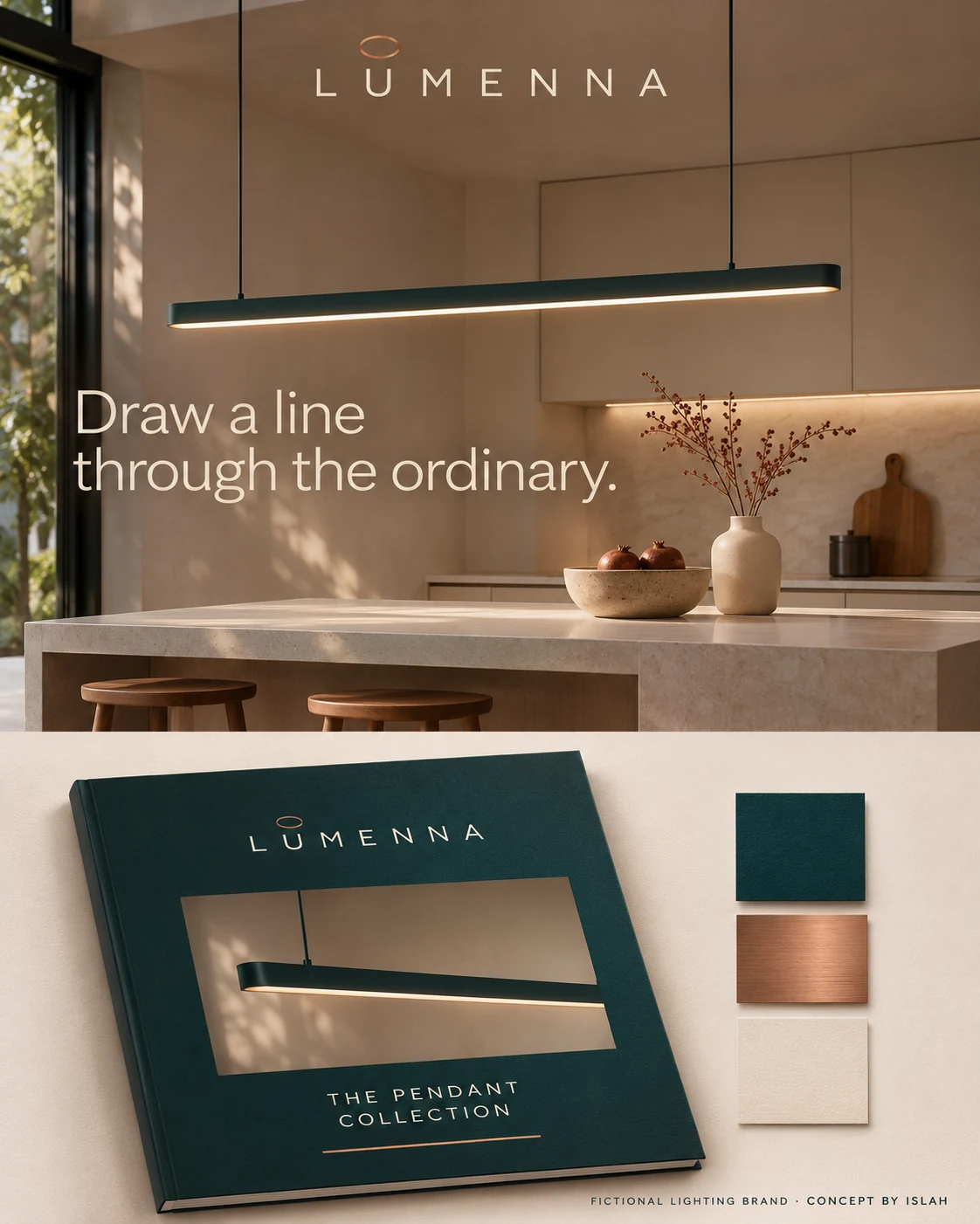
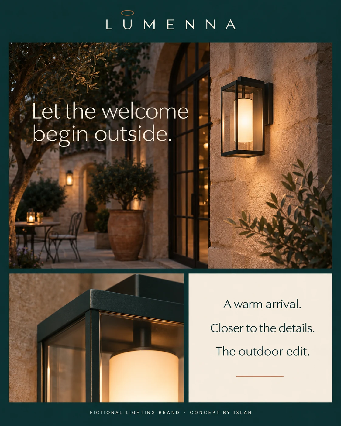
Collection names and recurring brand elements give each product family its own expression within a recognisable system.
Light for the moments in between.
The campaign copy describes moments rather than listing product specifications. A floor lamp becomes an invitation to read another chapter; step lighting highlights a quieter architectural detail. The print mockups explore how the same message could move from a social creative into editorial and poster formats.
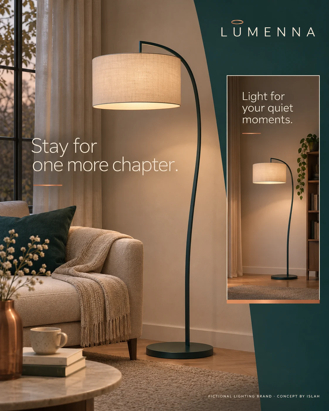
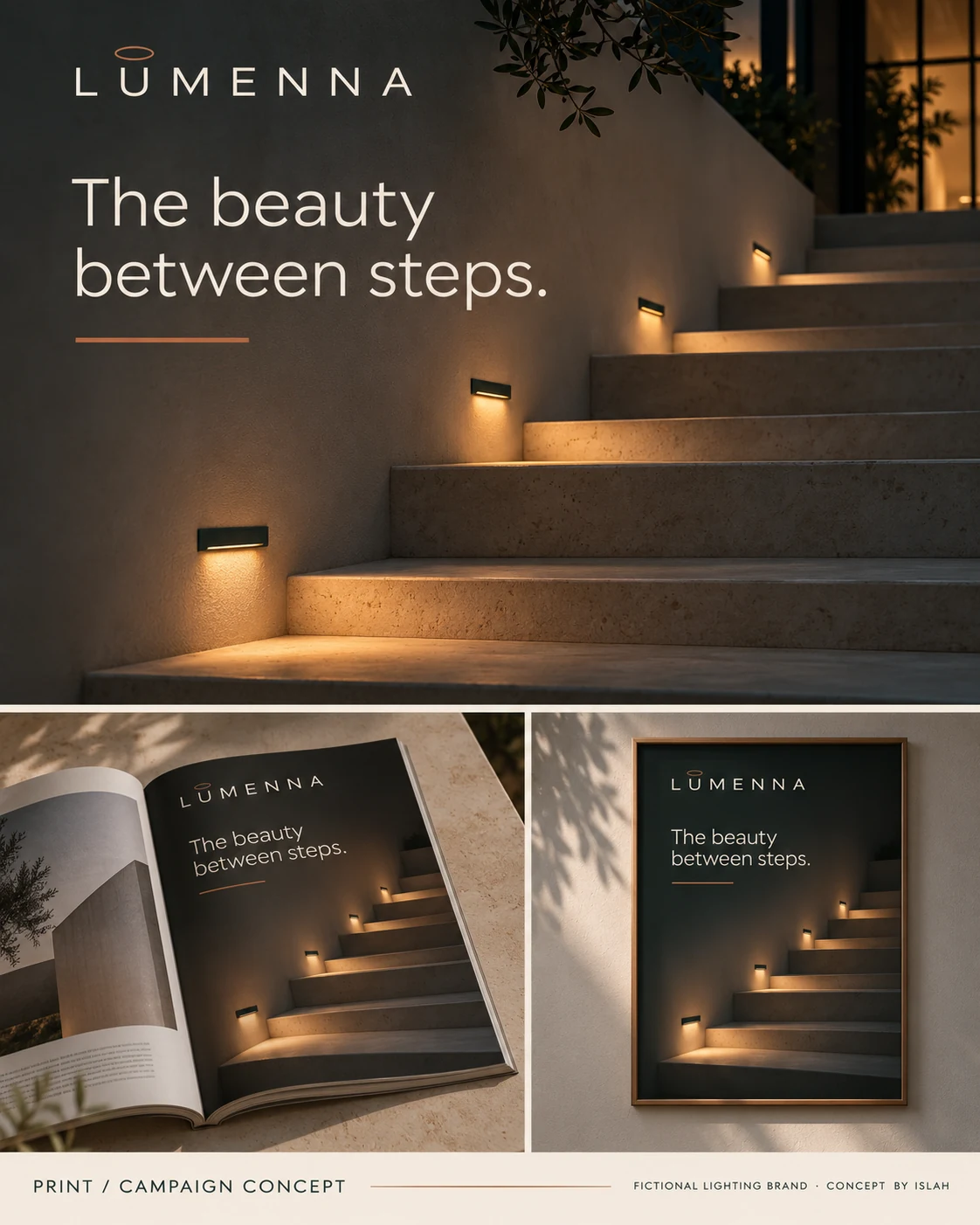
“Stay for one more chapter” and “The beauty between steps” connect different lighting scenes through a consistent, human tone.
From a closer look to a clearer view.
The sculptural pendant presentation pairs a room view with fabric detail and a small branded label. The website concept extends the identity into desktop and mobile mockups, using the track-lighting scene as a clear visual starting point. These applications explore how a lighting brand could feel connected across physical and digital touchpoints.
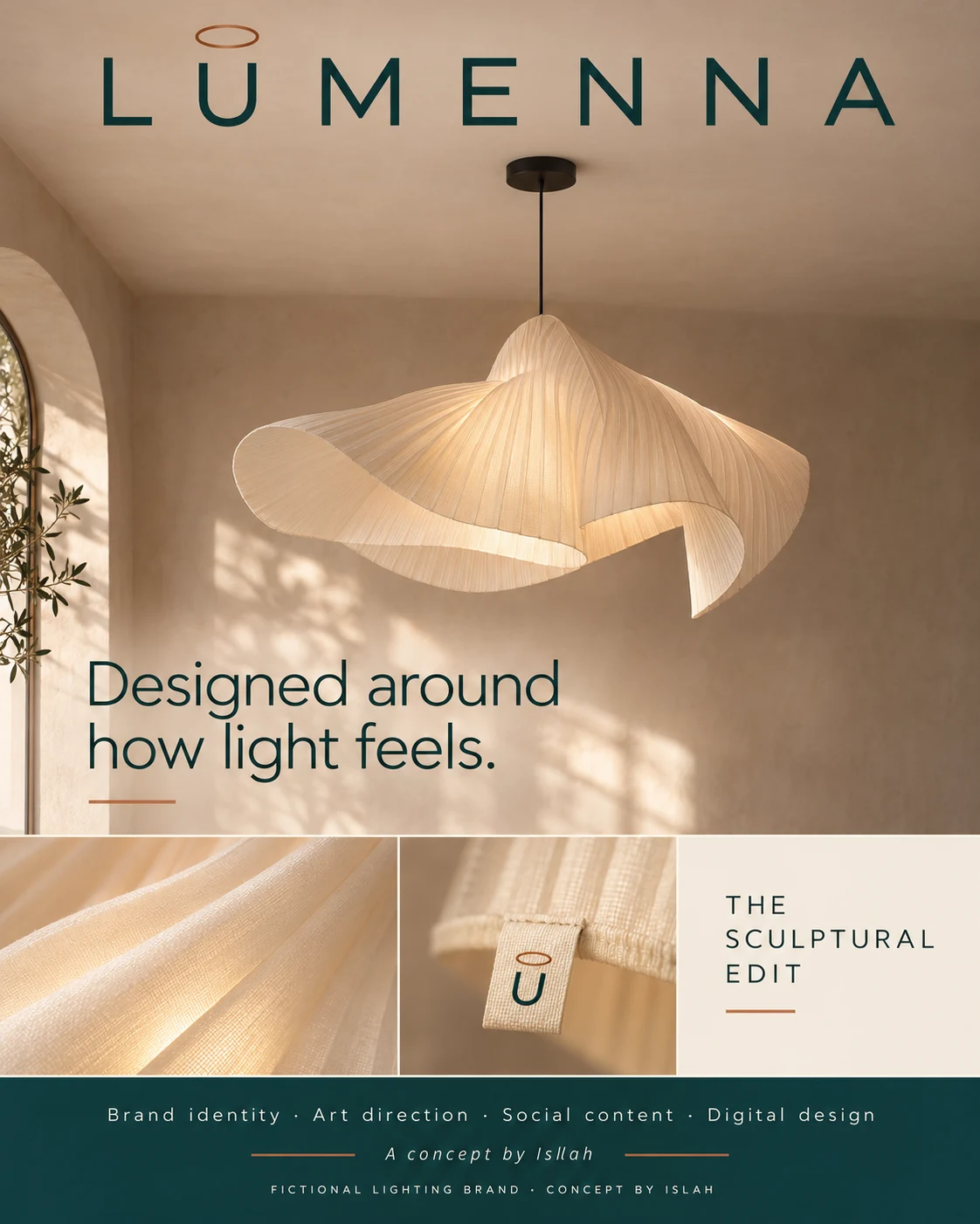
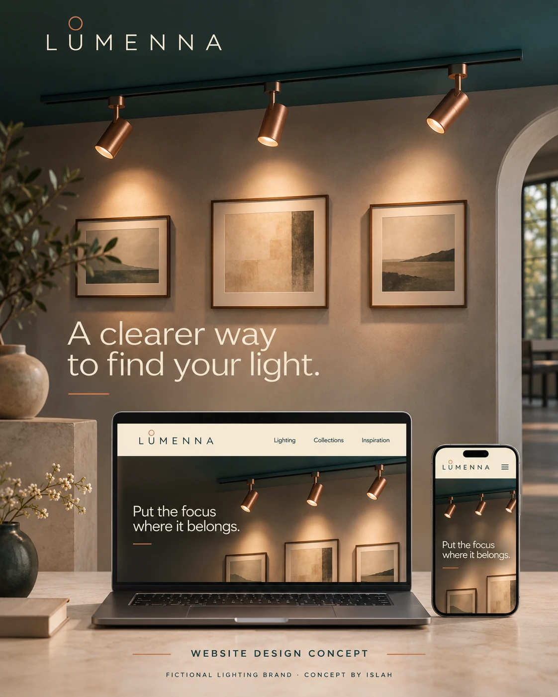
The material study and website mockups complete the concept. They illustrate a proposed brand experience, rather than a manufactured product range or a live online store.