Morrow
A considered identity for contemporary living. A case study exploring brand identity, art direction, packaging, social content and digital design through ten connected creative applications.
One identity. Room to evolve.
Morrow is a self-initiated furniture brand concept by Islah. The design explores how a contemporary collection could feel considered and recognisable across many settings. An expressive serif wordmark brings an editorial character, while the compact M monogram gives smaller applications their own signature.
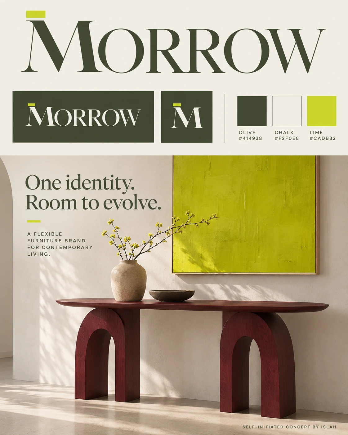
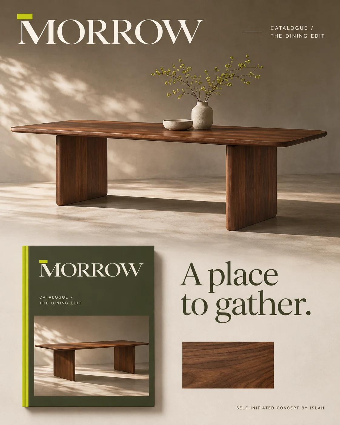
The identity board introduces olive #414938, chalk #F2F0E8 and lime #CADB32. The catalogue shows how that palette can frame warm wood and product storytelling.
A brand you can hold.
Packaging, care literature, hangtags and woven labels extend the identity beyond a screen. Olive creates a grounding field; chalk gives printed pieces breathing room. Small lime markers tie the applications together without competing with the furniture.
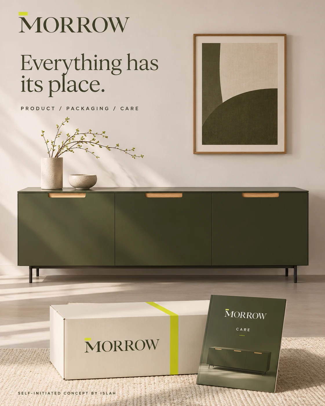
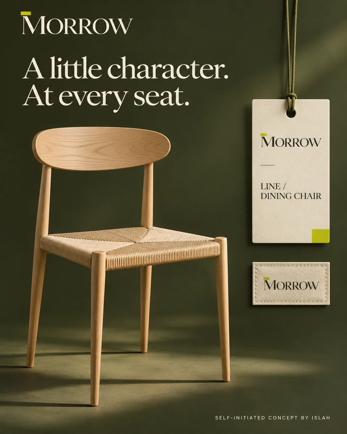
The sideboard presentation connects product, packaging and care. On the chair, the same identity moves into a hanging product tag and a discreet textile label.
A considered home, online.
The website concept pairs spacious layouts with product-led imagery, carrying the same typography and colour cues across desktop and mobile mockups. The writing-desk social series changes the viewing distance: a room scene introduces the piece, a close-up highlights a detail, and a clear product view completes the story.
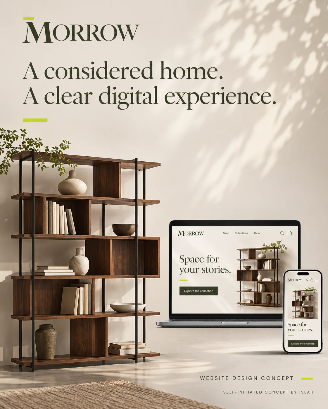
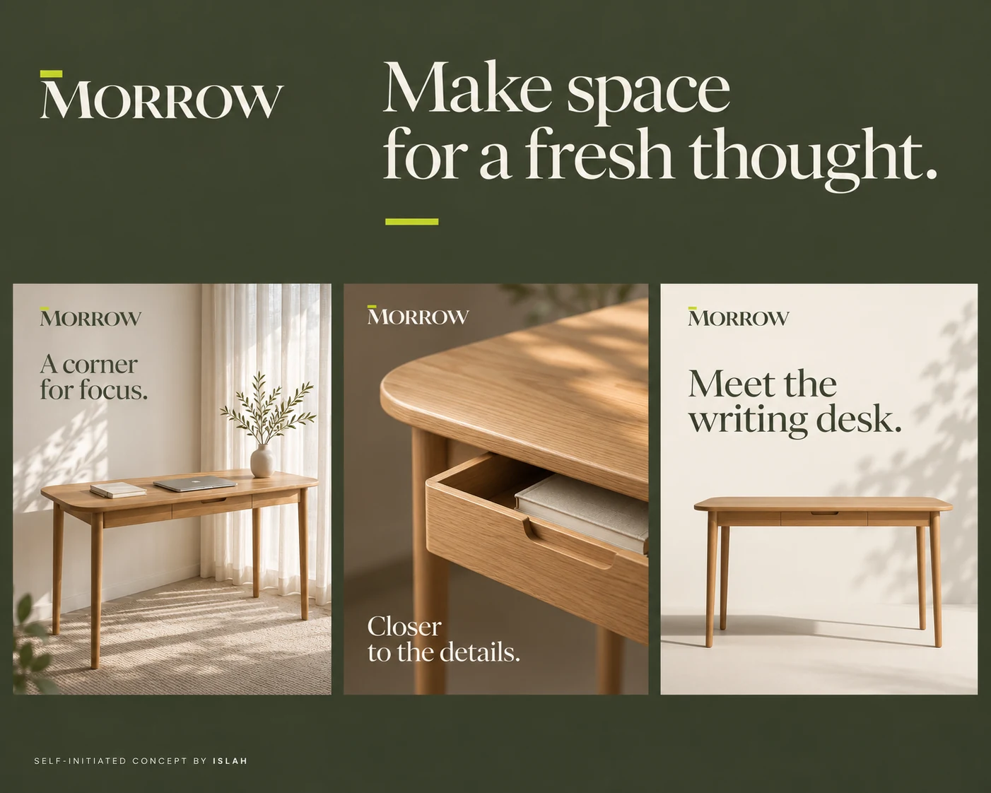
These are website and social design concepts. Together they demonstrate how one visual language can adapt to different screen sizes and content formats.
Make room for everyday living.
Soft daylight, tactile fabrics and restrained interiors give the living and bedroom campaigns a shared atmosphere. The copy connects each piece to an everyday moment, from settling into a living space to ending the day. The art direction gives the furniture room to be the focus.
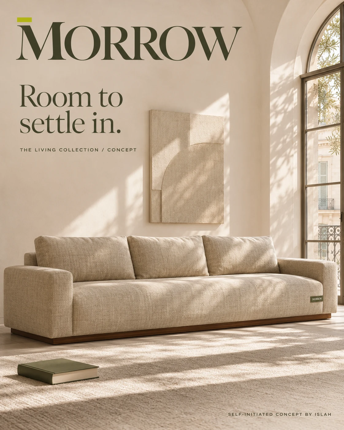
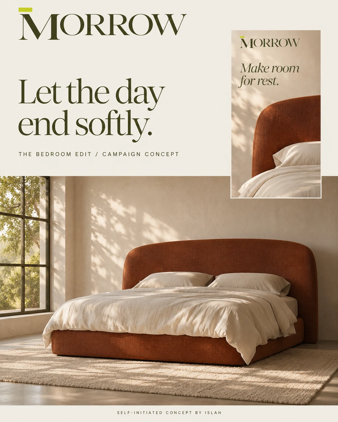
“Room to settle in” and “Let the day end softly” use different messages within the same calm, recognisable campaign system.
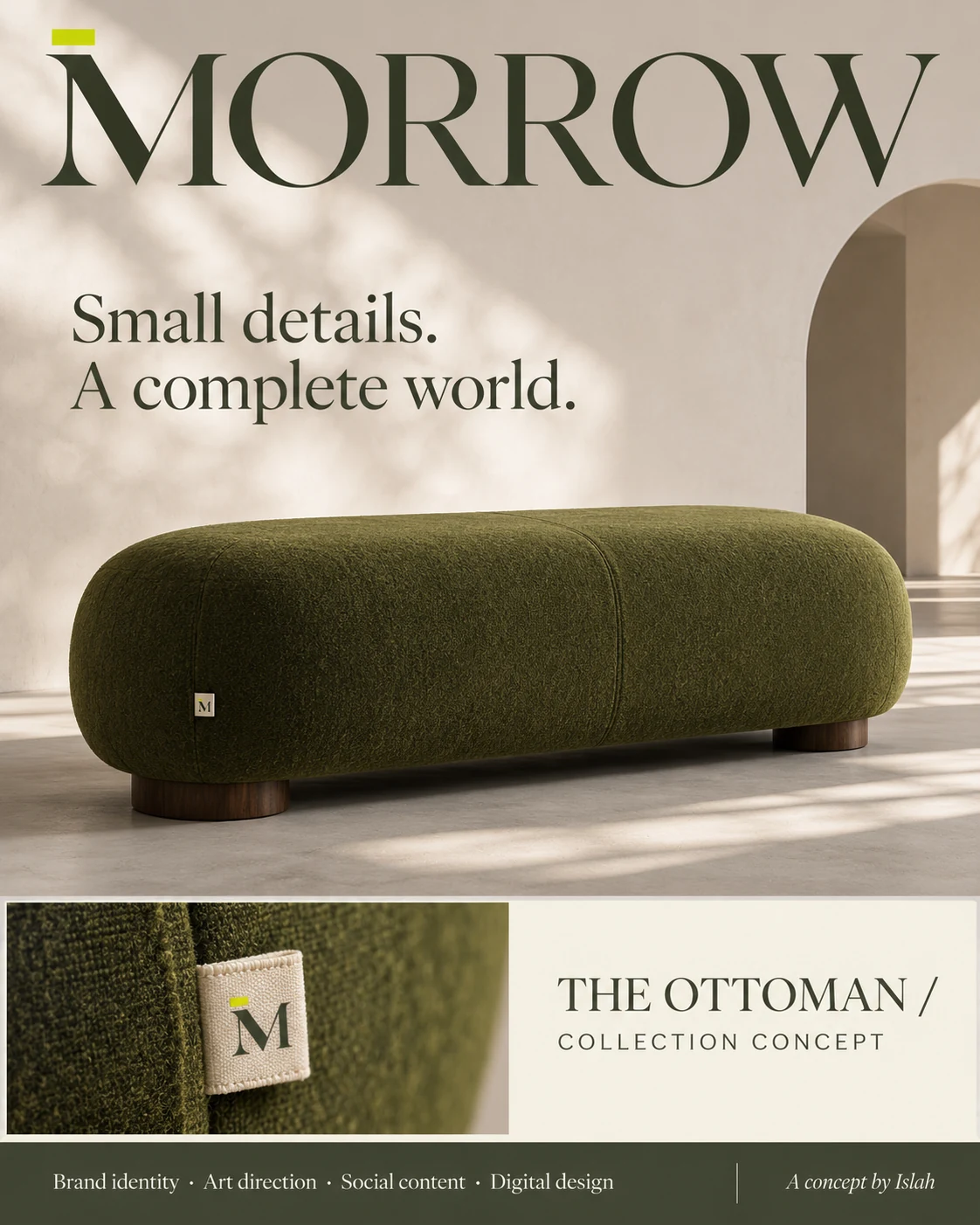
Small details. A complete world.
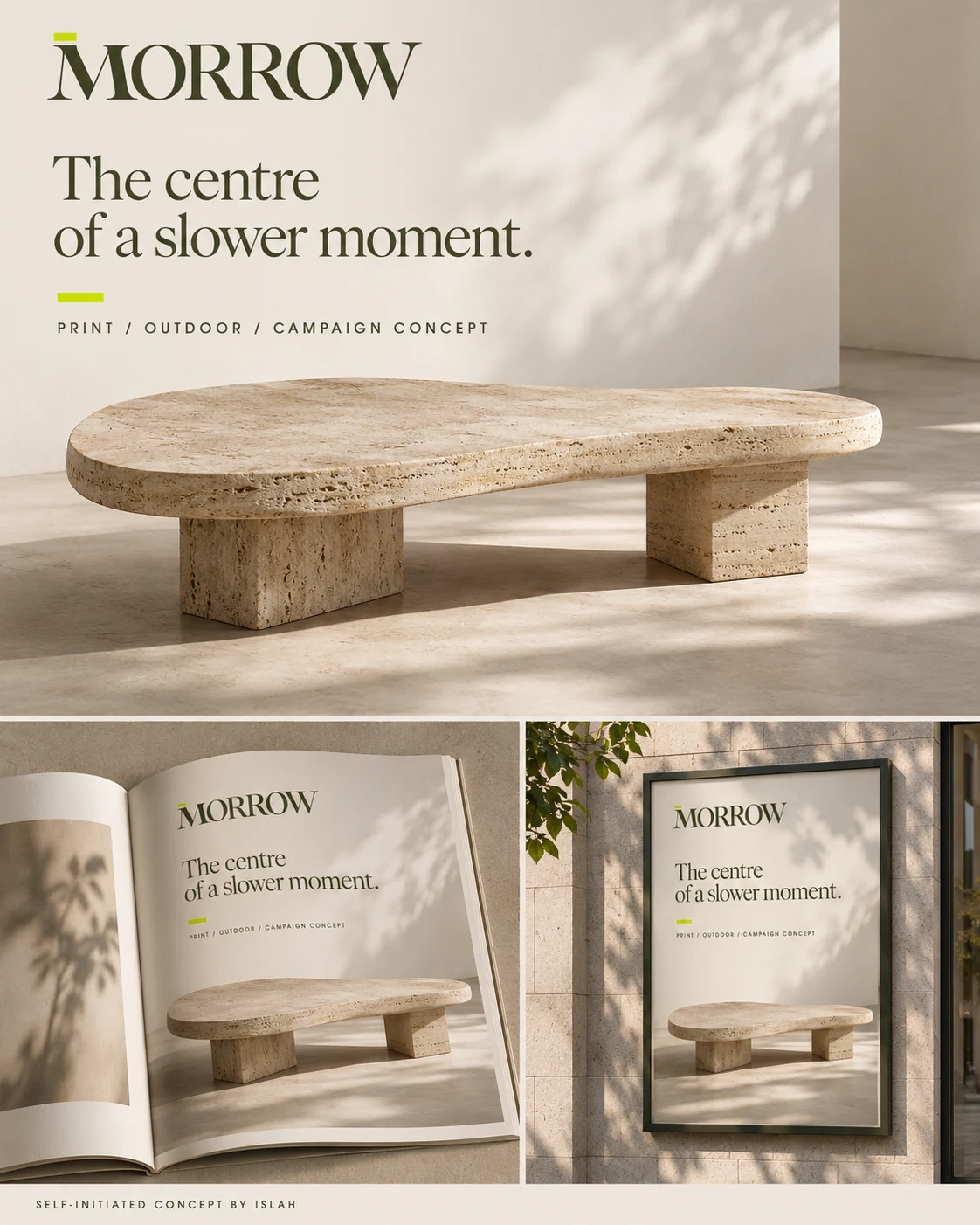
The ottoman presentation brings the monogram into a close-up material detail. The travertine table campaign then expands the identity into magazine and outdoor mockups. The repeated wordmark, tonal imagery and lime accent connect intimate details with larger brand statements.
From a woven label to an outdoor poster, the concept explores a consistent identity at different scales. All products and applications shown form part of the self-initiated presentation.