Velune
Make room for your ritual. A case study exploring a skincare identity through packaging, art direction, retail presentation, social campaigns and a digital design concept.
One identity. Every detail.
Velune is a fictional skincare brand concept by Islah, exploring a visual world built around personal rituals. A fine, open V symbol sits above a widely spaced wordmark. Plum, blush and pearl create a tonal palette that can move between dramatic campaign scenes and quieter product presentations.
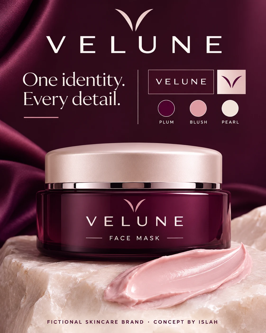
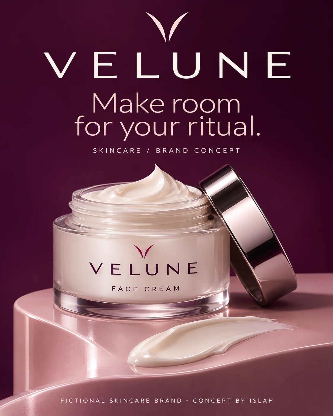
The identity board sets out the symbol and palette; the moisturiser presentation shows how that language carries into a simple product-led composition.
Begin with a little pause.
The campaign uses light, reflective surfaces and fluid shapes to frame skincare as a moment of pause. The cleansing-gel and face-mist concepts pair short, considered headlines with close-up product imagery. Plum backgrounds and soft pearl highlights keep the collection connected across different formats.
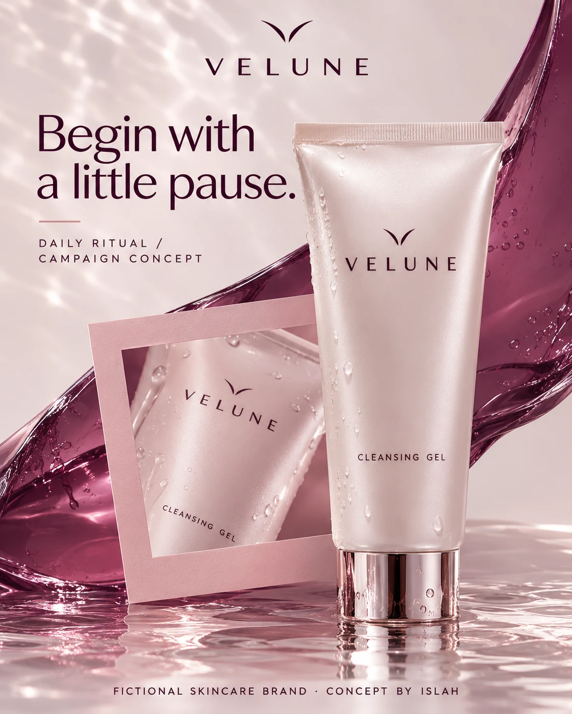
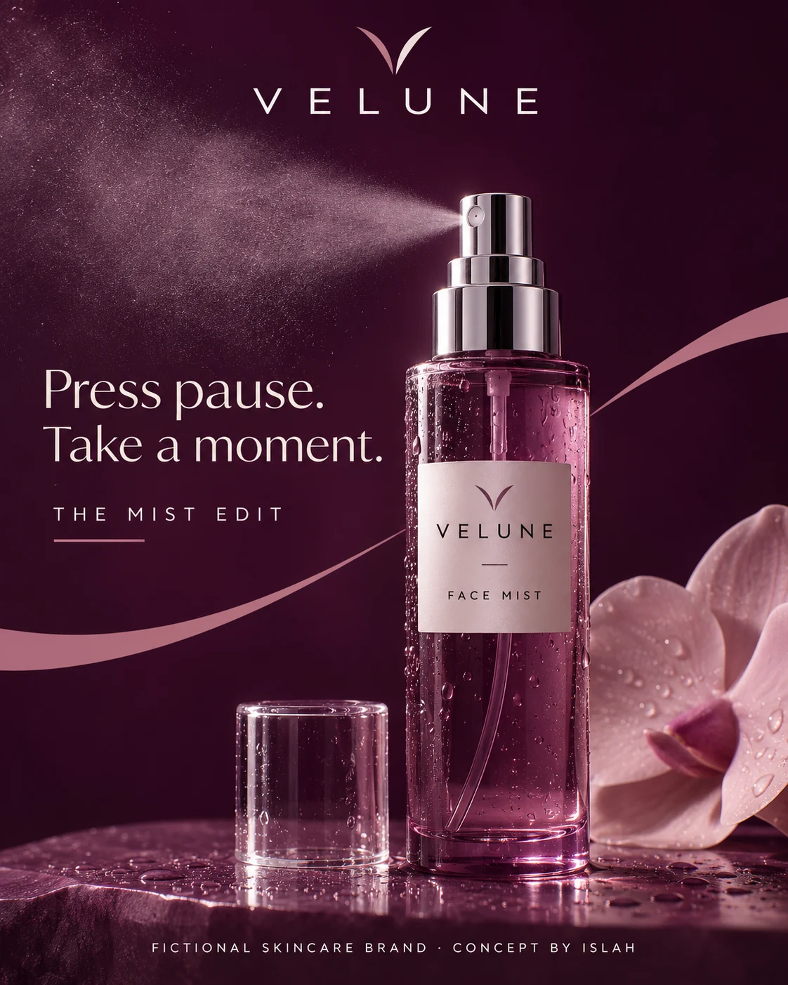
“Begin with a little pause” and “Press pause. Take a moment.” give the campaign a shared voice without relying on product efficacy claims.
Considered, down to the opening.
The packaging concepts carry the symbol, fine typography and curved graphic details across a serum carton, a cleansing-balm jar and an unboxing presentation. Blush outer surfaces and plum interiors create contrast, while small branded details connect the box, product and printed insert.
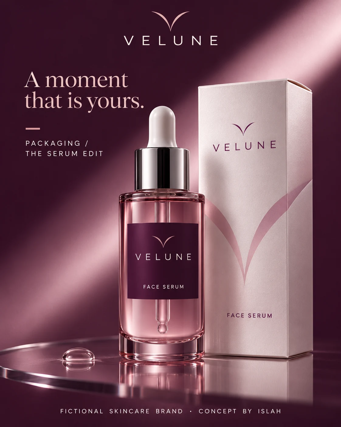
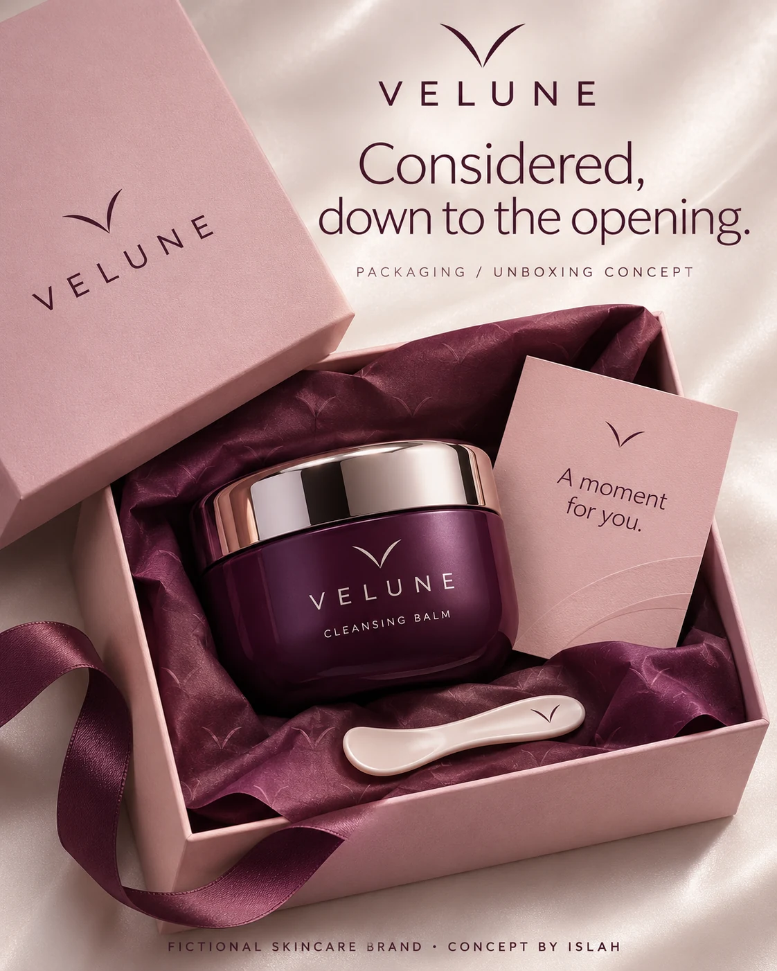
The serum and cleansing-balm mockups explore how a consistent identity can extend from a shelf-facing carton to the experience of opening a package.
Your ritual. Your own terms.
The lip-care display adapts the identity to a compact retail setting, repeating the wordmark across several product units and their shared stand. A hand-cream portrait brings a human context to the collection, keeping the same plum backdrop and understated copy.
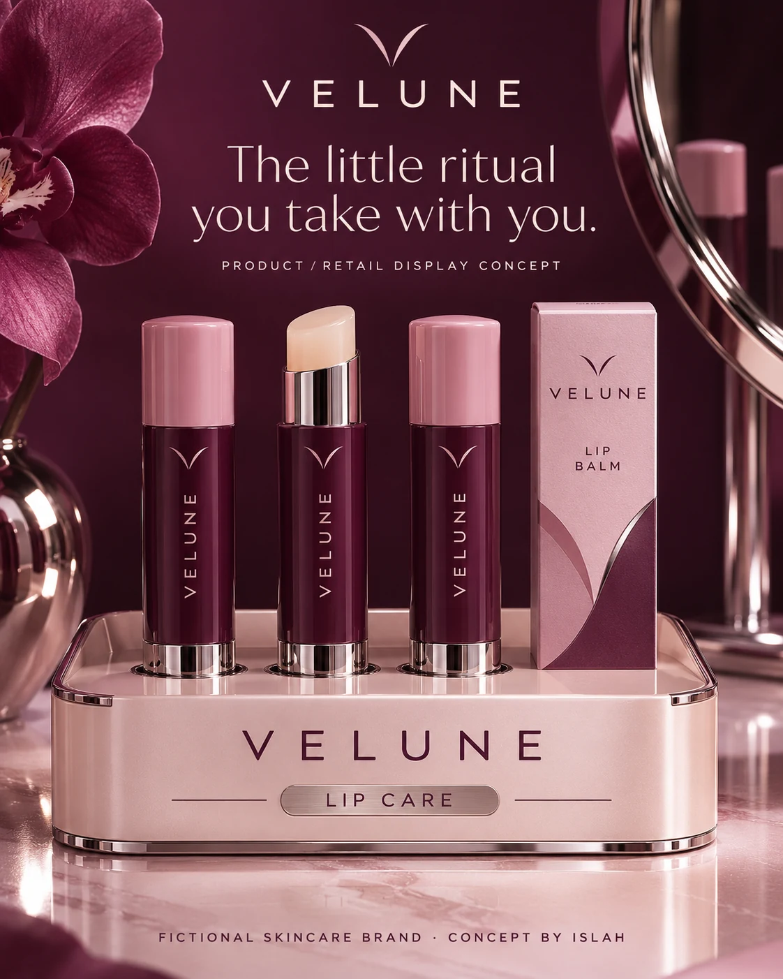
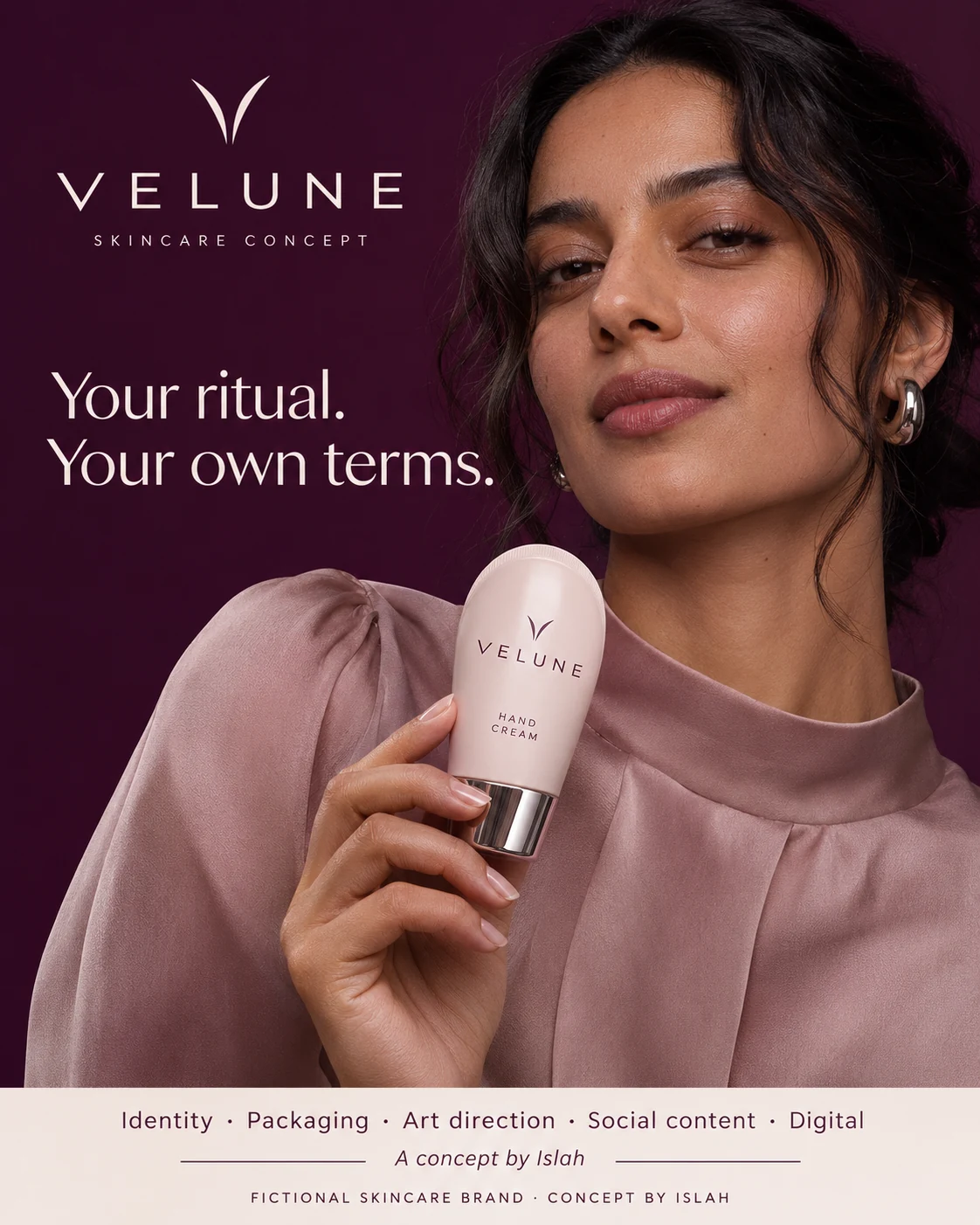
The retail display and portrait offer two ways to present the brand: through a coordinated product family and through an individual everyday moment.
Small format. Distinct presence.
The eye-cream series explores three social layouts using pearl, plum and blush as distinct settings within the same system. The website concept then brings the visual language into desktop and mobile mockups, with product categories and a clear collection entry point.
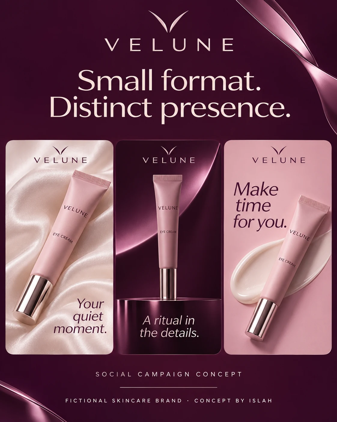
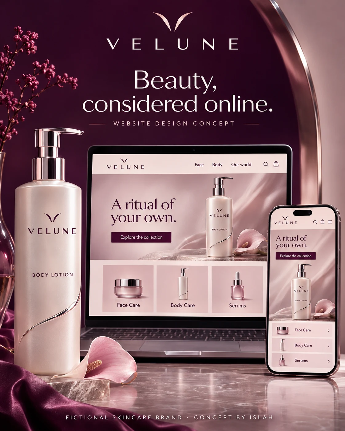
The social creative and website mockups show how the identity could adapt across screens. They are design concepts for a fictional brand, rather than a live store or a manufactured skincare range.